Developing products is not an easy task. Some are rich clients installed on physical machines while others live in the cloud and are accessed through browsers.
At one point in time, you have come across a product that you just disliked entirely. It either was not intuitive, overly-complicated, slow, colors made little sense, too hard to read and the list goes on.
What will generally happen:
A group of product owners will get into a room, draft out their ideas and start building out on paper what the product should look like, functionality and probably how much they want to price it at. It can be a thrilling experience; the chance to bring a new product to market.
After a few months of R&D, the MVP is ready to go to market and try out. Sometimes it will go well, but more often than not, you start to get feedback from customers or employees. It might include some of the following:
- Why doesn’t it do ____?
- Why did you use that color scheme?
- How do I find_____?
- I don’t understand how to do______.
- How is this better than what I did with “X Program”?
Let’s take a look at where things may have gone wrong.
New Features vs. Existing Problems
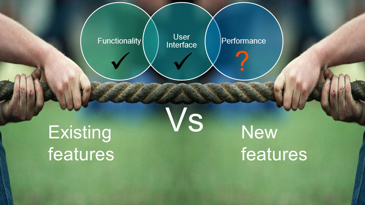
Remember the phrase “KISS” (Keep It Simple Stupid). As a team, we like to collaborate with each other. We “should” be talking with our users or customers and find out what they do and do not like or use in a product. It is hard to balance the need to fix current issues and also add new features.
The more features you add, the more complex your product becomes.
Make sure that as you are adding new capabilities that you do not complicate things to the point that your product no longer does the primary job you want it to and your users need it to. More features does not always equal more value. I personally, would rather have a product that does less, but what it does do, it is exceptional at vs. a product with a ton of features, but is complicated or buggy and I only end up using a portion of them, if that.
User Needs vs Design Needs

As a designer, I want things to look nice and be appealing. It is easy for me to make assumptions about my user without asking them first. More often than not those assumptions are going to be wrong! We are not designing for ourselves. We are designing for someone else, so bring them into the conversation along the process. It will help reduce those frustrations when a user doesn’t automatically understand the flow or can’t find the button that is “right in front of them”. Bring your users in during the design and development process – not after development is finished and you go to MVP.
If a User has a bad first experience with a product, they are unlikely to try it again. Make first impressions count!
Make sure that your user pool is diverse, different ages, jobs and perhaps different industries if possible. Try to stay away from legacy design patterns. Just because your users are “used to using” 2003 designs does not mean that they will appeal to 2017 users.
Have a Set of Design Principles
You need to determine what is going to be built and sometimes with a ton of ideas, it can be hard to find the right mix to move forward with. There are a few games I like play that help make this exercise a bit easier to visualize.
Innovation Games
Innovation Games are a great way to organize and get important feedback from a large group of individuals in a meaningful way. A few of my favorite games are below.
You can purchase the Innovation Games book through Amazon and learn several new tricks.
Need inspiration? View some of the Design Priciples used by some of the best products out there.
Know Your Users

- Understand user needs. Understand what their needs are before being able to deliver the right solution. Know your users by understanding their goals and frustrations through interviews.
- Show empathy by adapting to user’s needs. Be aware of user needs and actual behavior. Manage your user’s expectations and understand that you are not your user.
Clarity
- Clarity is all about the relationships between elements. Consider the relationships between items on the page and structure the page based on importance.
- Create structure and hierarchy. Provide timely feedback that encourages confidence in the product. Users should know the results of each action they take.
Consistency

There are many ways to provide a consistent experience for your users. Think about the following:
- Consistent interfaces. Allow users to develop usage patterns. Use standard controls consistently so that they behave the way people expect.
- Consistent language. Use the same term when referring to a particular action or object, and communication pieces to avoid confusion.
Use terms that a user will naturally understand. - For example: a wrong password
- 1) Your Password or Username is incorrect.
- vs.
- 2) Your method of authentication is incorrect. Please insert correct credentials to proceed.
- They both say the same thing, but one is clear, concise and to the point. The second only appeals to a highly technical audience and is overly-complicated.
- Consistent use of established patterns. Users look for patterns they already know to shorten the learning curve and understand new experiences across functionality or systems.
Look and Feel
- First impressions matter. A system that looks beautiful can further encourage confidence and trust in the system
- Aesthetics is a quality that people recognize, want and need. Your customers will look forward to using your product when it is pleasant to use.
You have every opportunity to make your product be the “next best thing” or even recreate the better mousetrap. No matter what route you take, make sure that you put your customer first and bring them in the process and you will succeed.
Good Luck with all of your designs!