Getting the Most from the Out-of-the-Box web part Series: The Text Web Part
The text web part is the new web part created to allows users to easily add plain text to their pages.
Functionality:
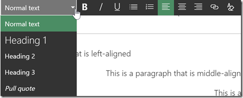
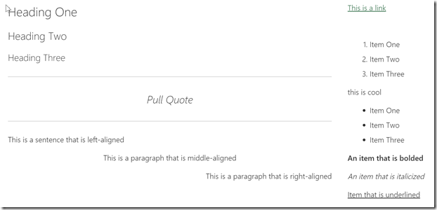
There are four text sizing options:
Heading 1: 28px
Heading 2: 24px
Heading 3: 21px
Normal Text: 17px
How to Use:
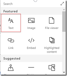
From the web part tool box, select the “Text” webpart from the menu.
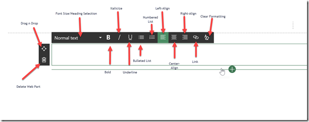
Click the dropdown to choose which heading or text you would like you use. You can also highlight text using your mouse and select to change the text to the new selection.
Line height is automatically set at 1.5. If you wish to have a single line spacing, press shift + enter when ready to move to the next line of text.
You have the option to bold, italicize or underline the text.
Favorite Feature:
My favorite feature with the text webpart is now being able to copy and paste from documents and the text being auto-formatted to look great including lists.
Closest Web Part in Classic Experiences:
Closest web part available in Classic SharePoint experiences is the Content Editor Web Part or a text-only content area in a page.
Feature limitations:
- Cannot select a different font. All web parts use Segoe UI as the primary font.
- No option to select a different color for text
- No Rich Text option. You cannot paste and image and text into the text webpart and have it wrap.
- No HTML or code view
For the Developers:
The text webpart is a highly-customized version of CK Editor. If you are looking to build your own SPFx webpart, do not use CK Editor as your base as it will break the out-of-the-box text webpart. Recommended to use Kendo UI as an alternative.


