The Importance of Progressive Disclosure in SharePoint Intranets
Have you ever looked at an intranet page that was filled with content and didn’t know where to start first? This is a very common scenario that happens way too often. In UI/UX Design, we have a term that we use to help combat this common practice, “Progressive Disclosure“.
The Great Balancing Act
Progressive Disclosure helps to become a solution to the two main issues that users face:
- Users want to be able to see all potential content that is available to them at all times
- The need for simplicity. Users don’t have time to learn new features or to read through a ton of content on a single page.
The Goal
The goal of progressive disclosure is to have users focus on a few consumable items at a time that then offer the ability to open a gateway to a larger set of data or content. Let’s view a few examples in real-life.
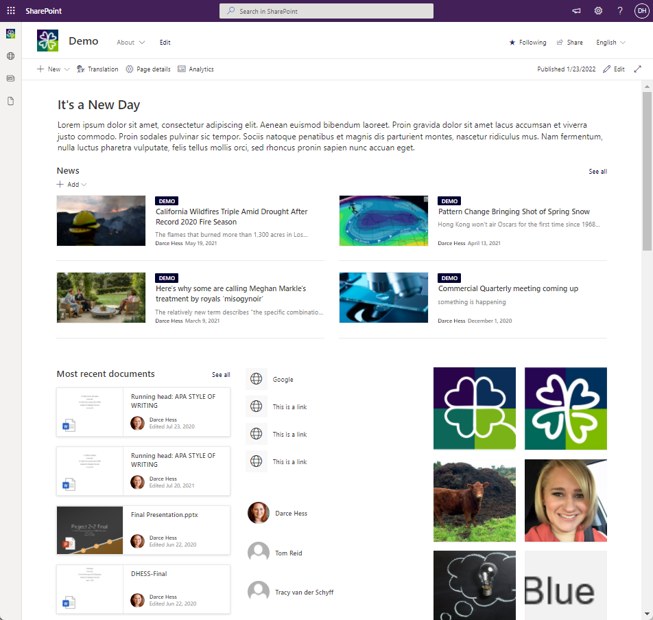
In the example below, there are a lot of web parts on the page. It is hard to know where you should look and also the hierarchy of the content.

How should you think about your content?
When planning your site, think about the primary and secondary categories of information that are the important to a user.
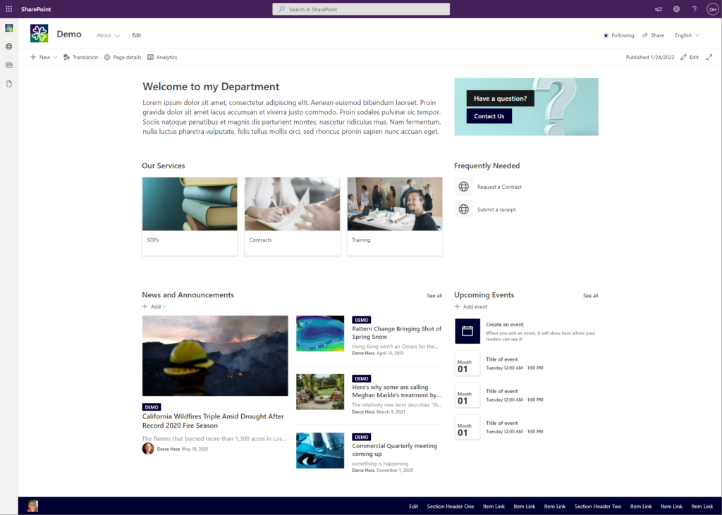
For instance, if I am on the landing page for a department or function, I may want to have a links list that shows the primary services that they offer, some way to consume news, events, and a couple frequently needed links.

In the example, I did not need to show on the landing page every SOP that existed for links for every training that is possible. It is ok to click into a primary category that is recognizable to the user to get to more information.
What about the three-click rule?
It’s a myth! The three-click rule was created in an effort to make sure users weren’t being taken down and significantly long path, but trying to limit the number of clicks to only three often causes those creating pages to overload the user with information and causes the site to become less usable than before.
As long as a user see the progressive that they are getting closer to the content they need, it is ok to have more than three clicks.
-Designers everywhere
Advantages of Progressive Disclosure
- Advances users will be able to click faster to where they want to go.
- Novice users will have less to consume and will be able to identify a path easier and faster
