Stop using Click Here and other Intranet pitfalls to avoid
“Click Here”, “view more”, and “learn more” are plagues on usability
How many times in your day have you encountered a quick links web part or section with a list of links or any type of action item that shows within an interface?
In the realm of digital content, phrases like “click here” and “view more” have become so commonplace that they often go unnoticed by the regular user. These terms, intended to guide the user’s navigation through a site or app, have been overused to the point of becoming almost invisible. They are everywhere, from websites to emails, and even in mobile apps. However, their overuse can lead to a lack of engagement and interaction, as users may not feel compelled to follow these generic instructions.
The saturation of these phrases in digital content can also lead to a lack of clarity and understanding. “Click here” and “view more” do not provide any context or information about what the user will see or do when they follow the instruction. This lack of transparency can lead to frustration and a lesser user experience. Instead, content creators should aim to provide clear, concise instructions that provide context and make it clear what the user can expect when they engage with the content.

How it affects usability
Did you know that web users only read around 20–28% of the content on a page? They tend to scan in an F-pattern, hunting for keywords that lead them to the information they need. This behavior is known as information foraging.
Hyperlinks play a crucial role in this foraging process. They stand out, usually highlighted in blue by default, but will often match the action color designated by the site, and promise more information at a click. But if we use vague words for hyperlink text, we may lose the impact due to the absence of relevant keywords. This results in what we call poor “information scent.”
When we say “click here,” it doesn’t tell the user what exactly they’ll find when they follow the link. It lacks meaningful context. This forces users to read the text around “click here” to understand what they’re clicking into. While “click here” might seem like a clear call to action, research suggests it could slow users down and increase cognitive load.
Another factor to consider is that the use of “click here” relates to clicking with a mouse. In a world where we access sites through many different devices where we you voice, touch, a mouse, and assistive devices to access and activate different links, this is an outdated way of thinking that focuses the user on a singular way of accessing the content versus fulfilling the task at hand.
Let’s talk about screen readers and accessibility

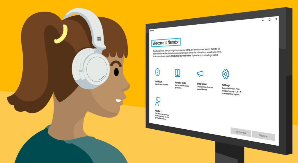
If you don’t have access to a screen reader, you can get a good idea by using the “tab” function in accessibility mode with a voice that will speak out what a user may encounter.
If you go through an interface with a lot of links that say, “click here”, ” view more”, learn more” etc. you will encounter the following issue:”
- “click here” …Link.
- “view more”…Link
- “learn more”…Link
Starting to see the issues? If you could not see the screen to gain additional context about what the link may go to, you would be lost. You wouldn’t know where those links go creating additional barriers for users to use your site.
Instead, you should write the action you want the user to take as part of the link text such as
- “Learn about Gastroenterology”
- “Sign-up for the newsletter”
- “View example document”
Tips to create better hyperlinks
- Be as descriptive and concise as possible:
For example, instead of saying “it”, specify what “it” refers to. - Start with a keyword:
This helps to quickly communicate the main topic of your content. For instance, “Elephant: The Largest Land Animal.” - Include concrete nouns:
This provides clarity and context. For example, “The Golden Gate Bridge”, instead of just saying “the bridge.” - Avoid using verb phrases:
This can make the text confusing when translated. Instead of “running the race”, use “participating in the race.” - Provide information that makes sense even when read out of context:
This is important for screen readers. For instance, “The Eiffel Tower, located in Paris, is a popular tourist attraction”, instead of just “It’s a popular tourist attraction.” - Refrain from discussing specific mechanics:
For example, avoid phrases like “click here”, which may not translate well across all platforms and devices.
