Release of New O365 App Launcher
Today, I received the updated O365 App Launcher into one of my tenants. First Release tenants should be seeing the changes appear this month while regular release tenants should see the change over the next month or so.
So, let’s check it out.
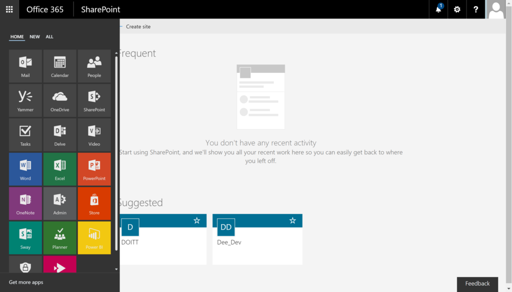
The new UI for the App Launcher comes with a new tabbed interface. The “home” tab comes with all of your apps automatically applied. You have the option to be able to pin which apps you would like to remain on the Home tab.
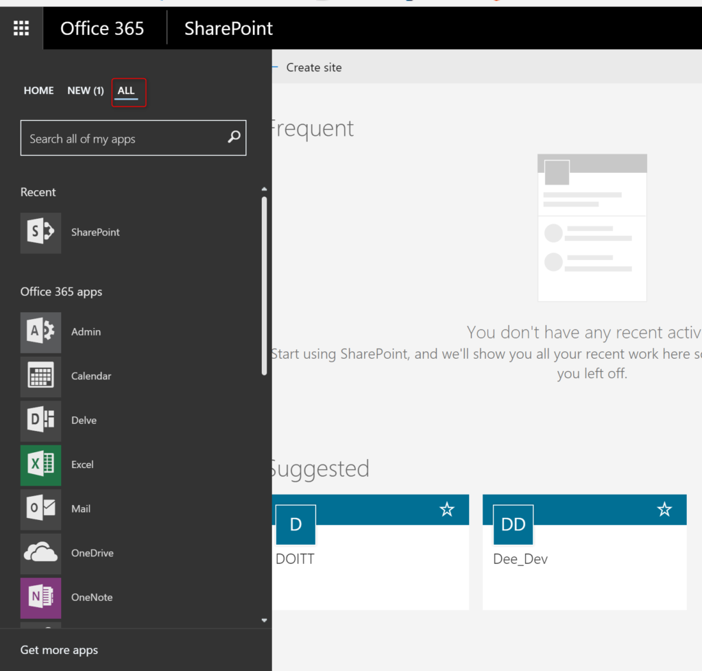
The third tab allow you to scroll through all apps that you have access to. You can also search for apps to find them faster.
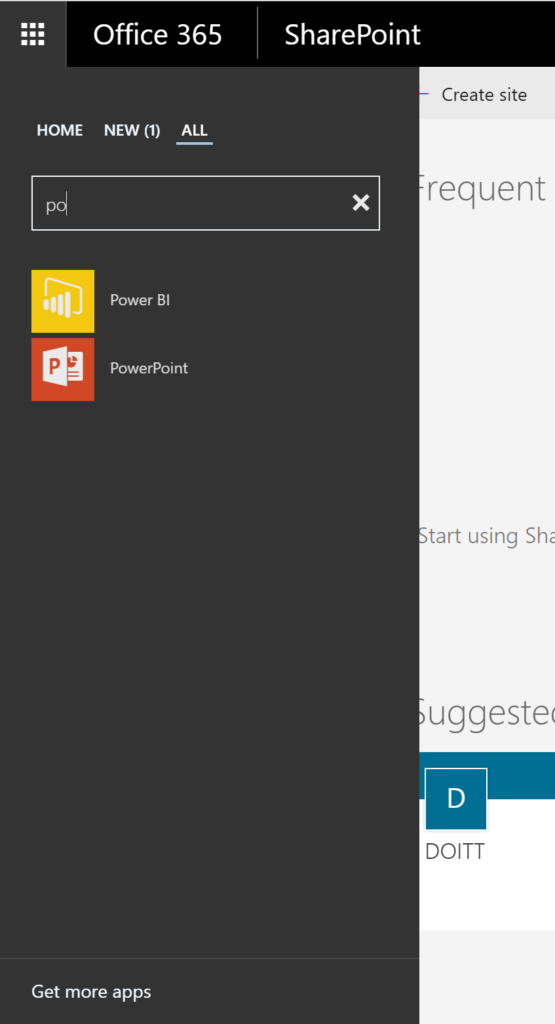
The search will do a filter as you start typing to narrow down the results to your selection.
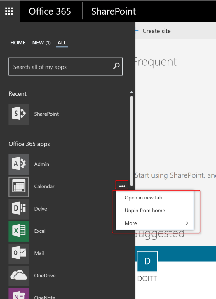
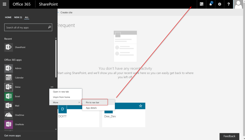
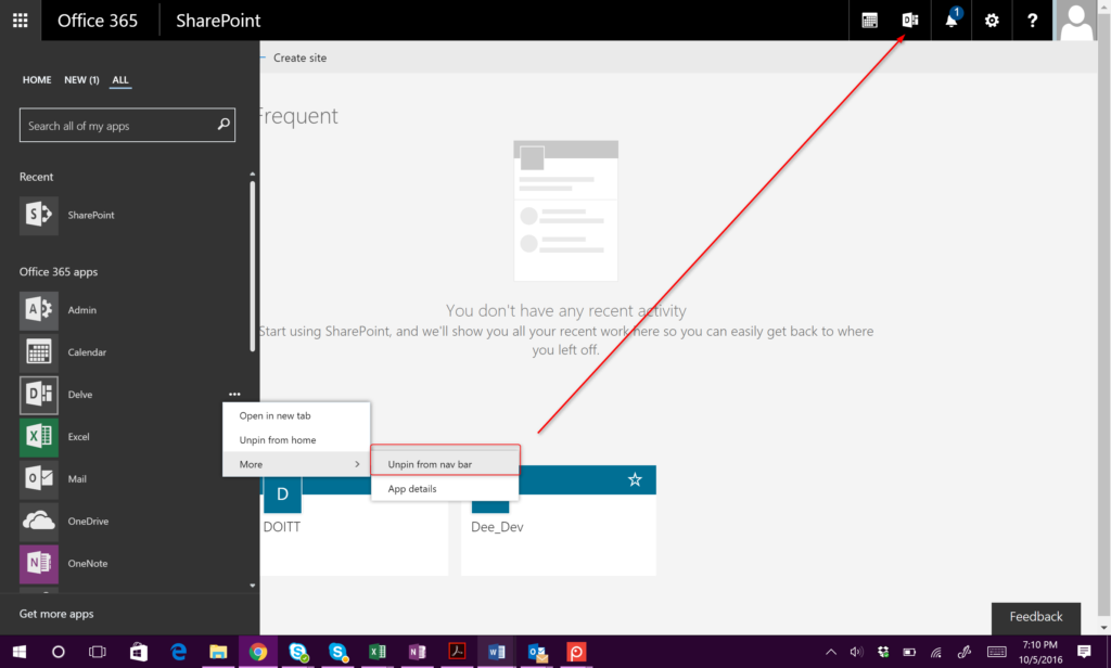
If you hover over the app, you will see a (…) to the right side. By clicking, you will see an additional menu with options for that app.
You can choose to pin the app to the Home tab, remove it from the Home tab, open in a new window as well as additional options.
Under “more” option, you can choose to pin the nav bar. By clicking, you will add the icon for the app to the top suite bar.
Through the same menu, you can choose to unpin the app from the suite bar as well.
A noticeable difference, you are now unable to size the options of the apps as you were in the past. Overall, this is a step in the right direction for Microsoft and I am happy to see some UI/UX changes for better.

