Modern Document Libraries in O365
If you are on O365, you should start to see the roll out of the modern document library in your tenant very soon.
This is a very exciting time for Microsoft and the SharePoint community as we start to see the changes towards a modern SharePoint experience.
So what are some features that we are used to and what are some things that are noticeably different?
New UI Changes:
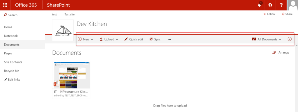
Where is the Ribbon? The ribbon has been a staple of both Office and SharePoint products for quite some time. The Ribbon has now been simplified to allow users to get to the information they need quickly by only offering options available to the user within that interaction instead of overloading the users with too many options at once.
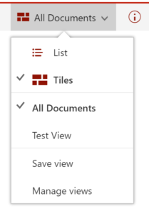
Users now have the option to view documents as a title view, where the preview of the document is available or by choosing the “All Documents” drop down, the user can choose to see the items in a more familiar list view.
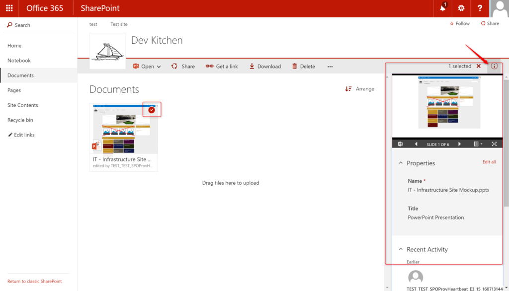
Users still have the option to be able to get to all of the views that they had in previous versions of SharePoint. One new feature is the ability to view all metadata for the document by selecting the document and clicking on the “i” icon at the far right of the ribbon.


