Microsoft has released a new carousel layout available for the Hero webpart in SharePoint. I will admit that this was one of the features that got me very excited, but also ended up being one of my biggest disappointments for a few reasons. Before I get into that, let’s talk about the new carousel and some use cases.
How to add and configure the carousel
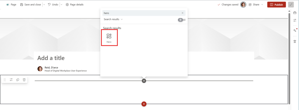
Create a new page and select a section to add the carousel to. You can search or scroll through the toolbox to get to the Hero webpart
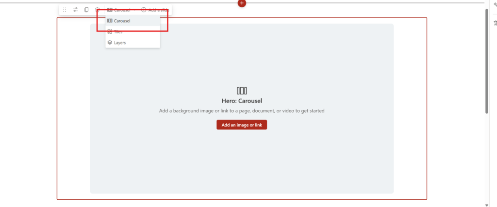
Select the Carousel layout from the dropdown.
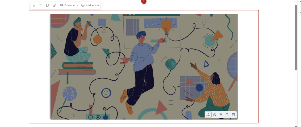
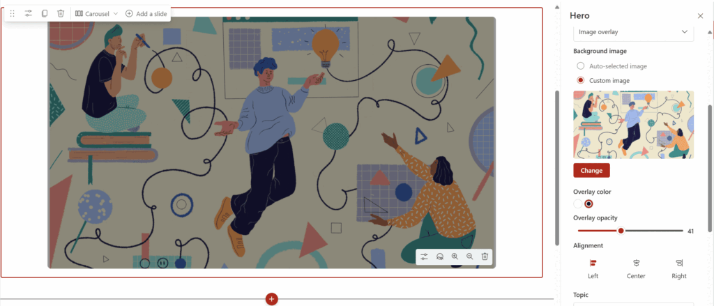
Add an image to create your first slide. Once you add an image, select the properties icon in the lower right corner of the side to open up the side panel. The side panel will allow you to configure all the information for the slide.
Slide Configuration options
You have several options that you can choose from on a slide-by-slide basis to help optimize the look and feel of the slide to tell your story.
Style
Microsoft has provided three different options for styling of each slide in your carousel.
- Image Overlay
- Text Block
- Diagonal Split
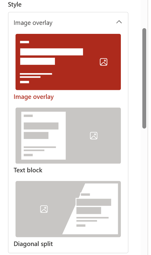
Image Overlay
The image overlay allows for you to have an image background for your slide with overlayed text for a heading, descriptions, and call to action. You can select to have a light or a dark overlay on top of the image to allow you to optimize how your text will look on top of the image as well as aid in accessibility.
Fill in the content for the slide:
- Topic
- Header
- Description
- Call to action text
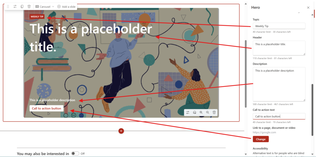
Next, determine the alignment for the content in the slide:
- Left
- Center
- Right
These are great options to help work around custom images.
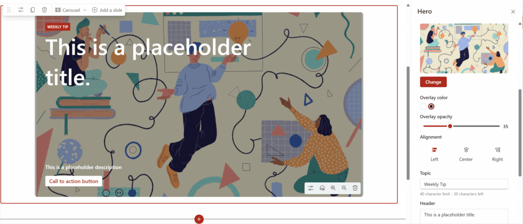
Text Block Layout
The text block allows for you to have a solid white background for your slide content. It ensures accessibility no matter the background image. The only configuration options for this style are the alignment of the block on the slide.
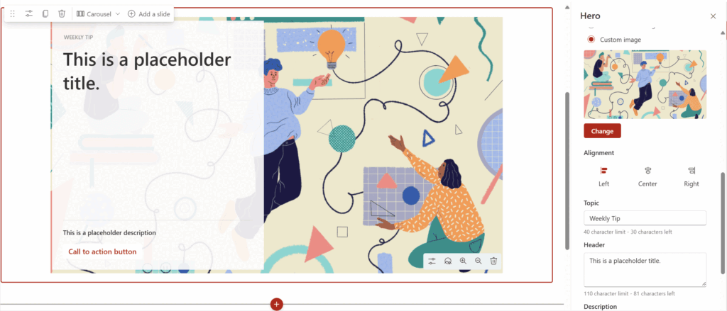
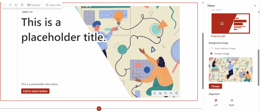
Diagonal Split
The diagonal split shows your text from one side moving into a diagonal cut of the background image. For this style, you can determine the alignment for left or for right.
You can select which style you would like to use per slide that you add to your carousel giving you ultimate freedom to customize your story.
Elephant in the room regarding carousels
Carousels (aka sliders) can look slick, but from a UX perspective, they’re often considered bad practice. Here’s why:
1. Low Engagement
Most users ignore carousels—this is known as “banner blindness.” Studies show:
- Only the first slide tends to get meaningful interaction.
- Users often scroll past before the second slide even loads.
2. Cognitive Overload
Carousels force users to process multiple messages in quick succession:
- Too many competing calls to action.
- Harder to focus on what’s actually important.
3. Timing & Control Issues
Auto-rotating carousels are:
- Too fast for some users to read.
- Too slow for users who want quick info.
- And worst of all, often have no pause option.
4. Mobile Experience Suffers
On smaller screens:
- Carousels take up a lot of vertical space.
- Swipe controls can be unintuitive or buggy.
- Tiny dots as navigation? Not ideal for fingers.
5. Accessibility Challenges
They’re hard to make:
- Keyboard navigable
- Screen reader friendly
- Consistently usable for people with motor impairments
At the end of the day
Microsoft has provided what every business I have ever worked with has asked for, a carousel. The downsides of this carousel is that it is very large, over 600px tall which on smaller screens or older laptops that many companies have means that the slider will take up a significant portion of any screen. This can lessen the chances of a user continuing to scroll on your page to view the rest of the content.
I would recommend to not have more that 3-5 slides also knowing that a user is most likely never going to wait for the scroll through and to expect drop-off after the first slide.